Fitting a Godot game to every screen: lessons from the iPhone Duo
The new iPhone Duo has two screens, and Bossy Blocks didn’t fit either of them. Version 2.1 redesigns everything around the board so the game fits whatever it’s played on. Along the way it fixed the layout on older, wider Android phones, and brought Bossy Blocks to iPad. This post is how we did it, and what caught us out; what’s new in 2.1 is the short version for players.
The problem #
Bossy Blocks was designed on an iPhone, and assumed every screen was exactly that shape. Version 2.0 had no logic for any other. Wider Android phones already got a boxed-in look, but the game was playable on them and it was easy to put off. The Duo made it impossible to ignore.
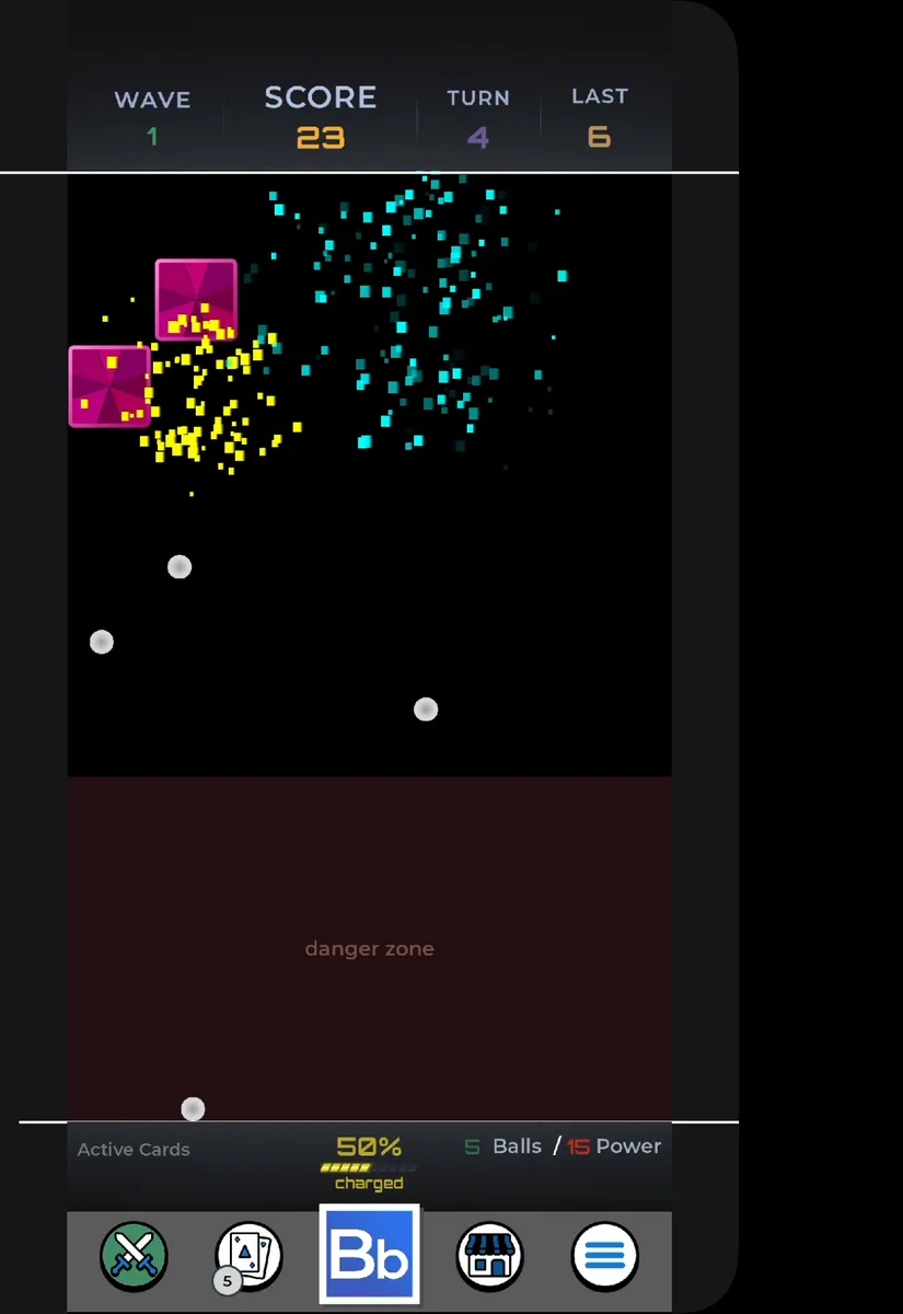
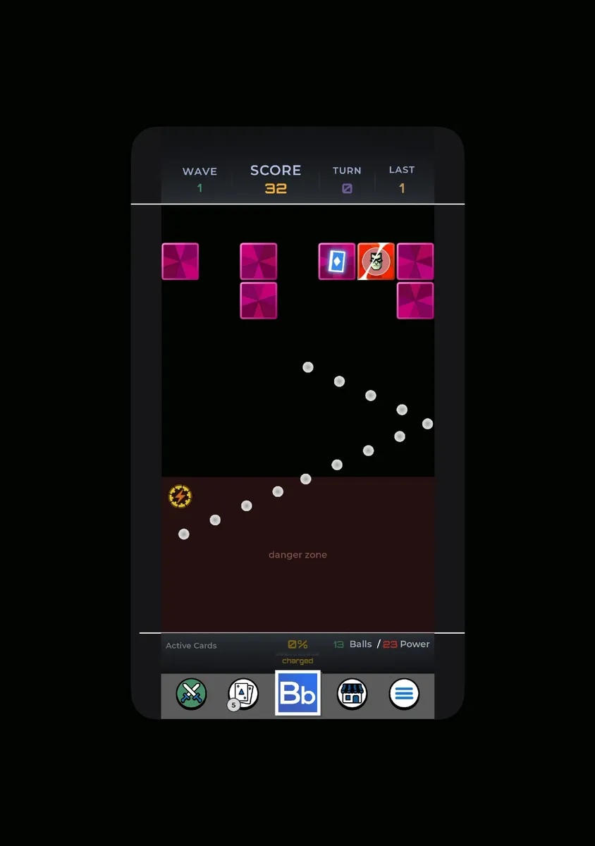
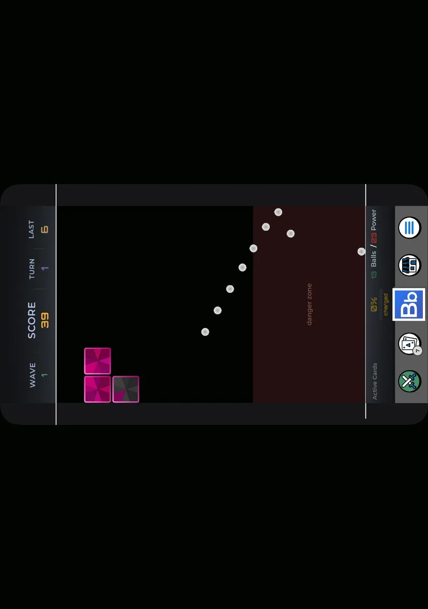
On the outer screen, a little wider than an iPhone, the game sat against the left edge with a black strip down the right. On the big inner screen, iOS ran it like any iPhone app: a small phone-shaped window floating in black, which turned on its side when you turned the device.
The first idea: centre it #
Before we had a Duo in hand, the first 2.1 beta centred the game in a column the width of the design. That meant reworking every panel and popup that assumed the left edge of the screen was the left edge of the board.
On a real Duo it wasn’t enough. The bars ran edge to edge while the board stayed a narrow column, like a strip cut out of a bigger picture, and the inner screen was still a phone-sized window. Centring fixed where the game sat, but it didn’t look like it belonged on the screen.
The solution: design for any shape #
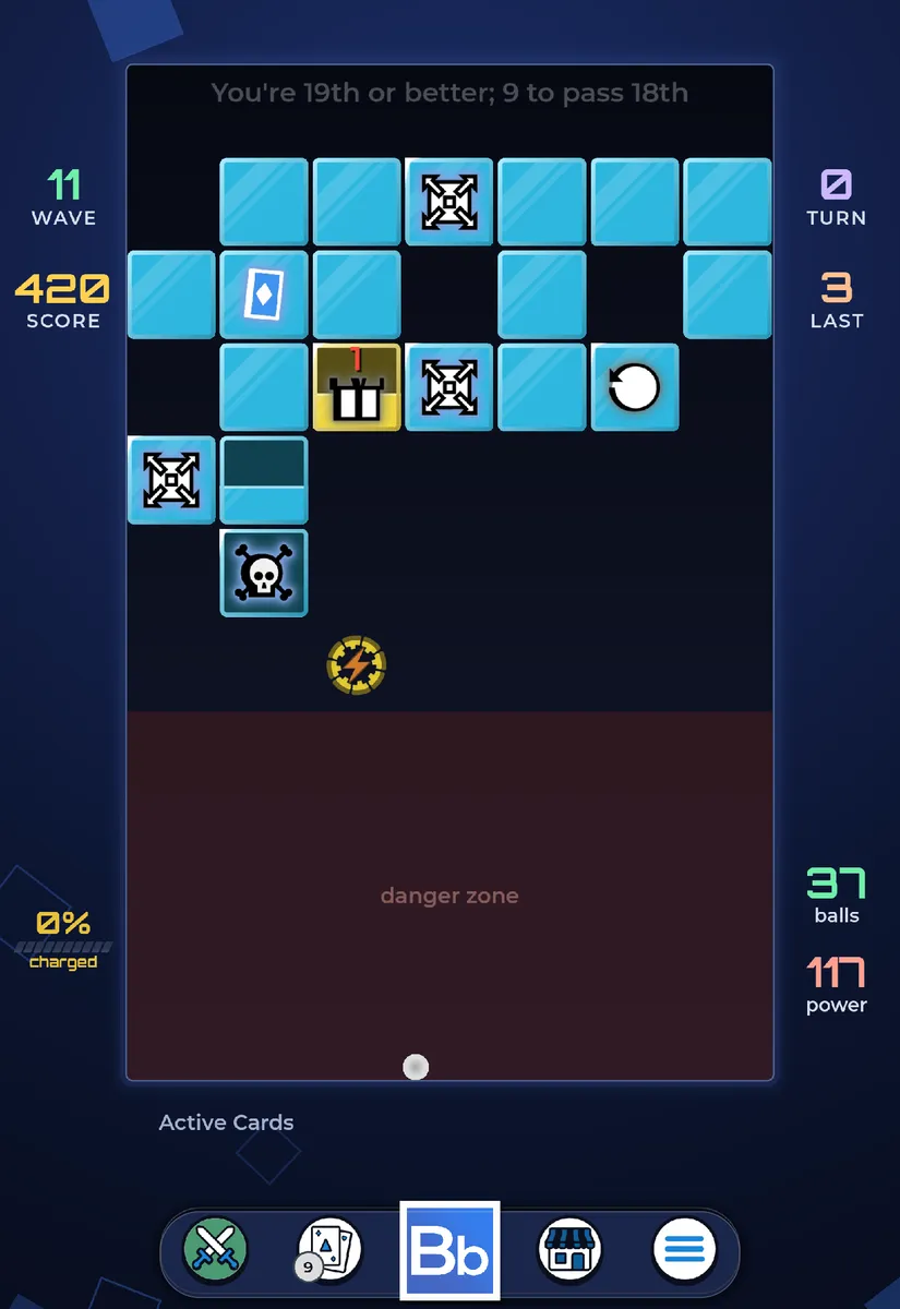
- One ground instead of bars. Everything outside the board is now one deep blue surface with blocks drifting slowly across it. With no panels behind the stats, there’s no edge to look cut off however wide the screen is.
- A framed board, with a lit frame and a dark navy gradient. It stays dark because most of the game’s effects add light, and would wash out on anything lighter.
- Stats in the wings. When there’s room beside the board, the stats move into columns either side of it, and the board moves up and grows to fill the space: about 10% bigger on the Duo.
- The same board everywhere. The camera zooms to frame the board rather than redrawing it, so every bounce lands in the same place on every screen. That matters for the Daily Challenge, where everyone plays the same board.
- A native app on the big screen. The game is now built for iPhone and iPad, so on the inner screen it runs full-screen, and stays upright when you turn the device. It’s also why 2.1 is on iPad.
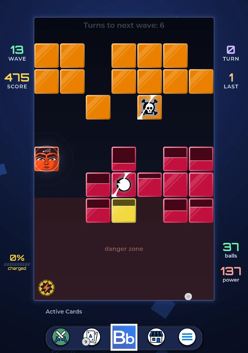
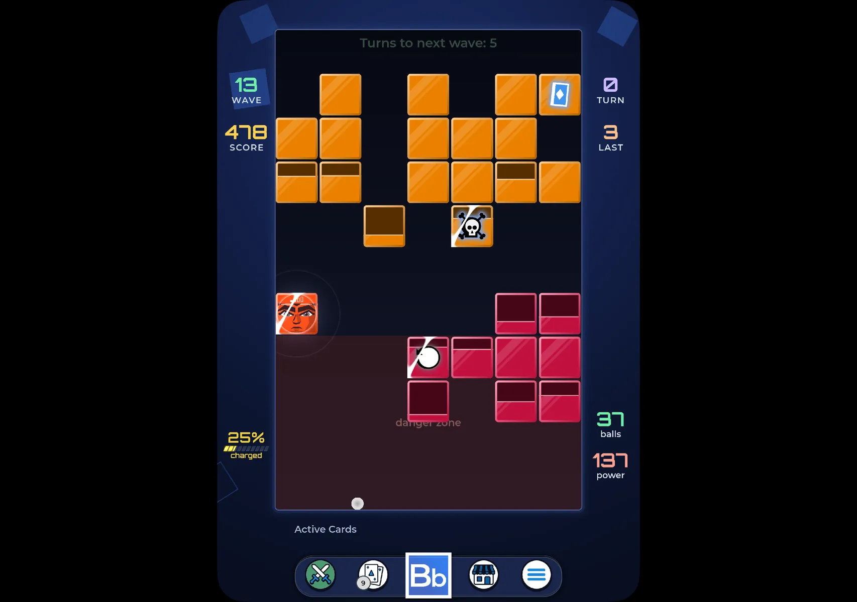
Not just the Duo #
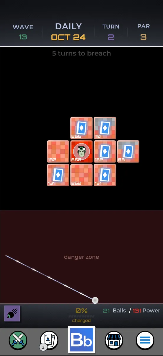
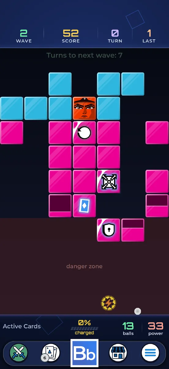
Nothing in the redesign is specific to the Duo, and it fixed a problem we already had. Many Android phones, especially older ones, are 16:9, wider than an iPhone. They got the iPhone layout in a column, with black down both sides. Now the ground fills the screen. Same board, same phone:
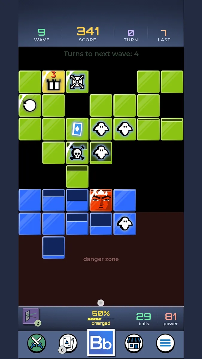
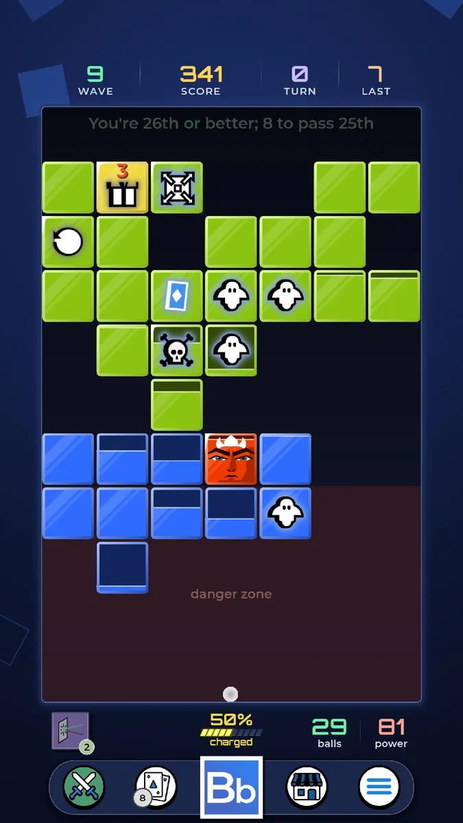
Taller phones get more room above and below the board, and tablets, including iPad, get the wings and the bigger board. On the iPhone, where nothing was broken, the game simply gets the new look:
What caught us out #
For anyone building a Godot game for phones:
- Use “expand” stretch, and expect your layout to break. It gives a wider screen a wider viewport instead of black bars, which is right, but anything that assumed the design size ends up in the wrong place. Anchor to the centre, not the left: “150 pixels from the left” is on the board on an iPhone and off it on anything wider. The same goes for panels that slide in: tween them to the centre, not to x = 0.
- Turn on stretching in desktop builds too. Then dragging the window into a new shape previews that screen instantly. It’s still how we iterate, but it’s no substitute for the device: the desktop has no camera cutout, no phone-sized window on a big screen, and none of the Duo’s quirks.
- Popup windows don’t stretch. In Godot a
Window’s size is a plain number, not something that follows the screen like the rest of the UI, so every full-screen popup needed hooking up to the screen’s size by hand. - The screen can change size mid-game. Opening a foldable resizes the viewport while you’re playing, so the layout can’t be worked out once at startup. Everything lays itself out again on every resize.
- A moving camera breaks screen positions. Hints and arrows that point at a block turn its world position into a screen position. While the camera sat still in the middle, a shortcut worked; once it zoomed and moved on wide screens, every shortcut broke.
Camera2D.get_screen_transform()alone maps the camera’s local space, so it’s only right while the camera sits at the origin. Now one function does the conversion, and everything uses it. - Draw the ground in the world, not the UI. The ground sits above everything except the board, so debris or the tail of an effect that strays past the board’s edge is hidden, as it was under the old solid bars. The one thing that has to cross it, the card that flies from a block to your hand, is drawn on top. When the screen shakes, the board shakes inside the ground and the ground stays still.
- An iPhone-only app runs in a window on big screens. iOS shows it as a small phone-shaped window, and turns it sideways with the device. The fix is building for iPhone and iPad, which is also what put the game on iPad.
- Don’t trust the safe area at launch. On the Duo’s outer screen, iOS sometimes reported too small a safe area until the device was folded and unfolded. The stats in the wings sit in the top corners beside the camera, so they now never start above a fixed minimum, and the game rechecks the safe area twice a second.
- Test the shapes. The splash screen’s layout is checked at every aspect ratio from 21:9 to 4:3, and the HUD has tests at phone and Duo shapes. One trap: our headless test window is square, which is wide enough for the wide layout, so the test harness sets the phone’s shape before every test.
Try it #
Version 2.1 is out now on iPhone, iPad and Android.


If you play on a Duo, a tablet, or any phone where something still looks off, we’d love a screenshot at info@irontreble.com.
We post clips and updates on TikTok, Instagram, Threads and Bluesky: